Useful CSS to add extra design elements to your promotion.
You can use CSS to enhance the look of your promotion. Here are some useful CSS codes you could use.
When creating advanced design promotions on BeeLiked, we often rely on a bit of added CSS code to enhance the look. Simply copy the code in the examples below.
Many of the CSS snippets will need to be added to Theme > Advanced (see below screenshot)

Transparent color block
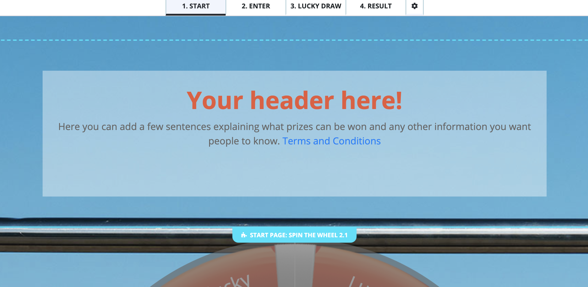
If you need some text or an image to really stand out against your page background, you may want to add a block of color to sit behind it. You can make this color semi-transparent so that the background image still shows through. Here's what it looks like when the color is white.

The code that you need to achieve this effect is:
#blkd-page-start .blkd-block.blkd-block-top-content{
max-width: 840px;
margin:50px auto;
background: rgba(255, 255, 255, 0.4);
}
and for a similar effect on either the Start page or Lucky Draw page, use this:
.blkd-block.blkd-block-top-content{
max-width: 840px;
margin:50px auto;
background: rgba(255, 255, 255, 0.4);
}
Please note that the color referenced above is rgba(255,255,255) which is white, but it has a transparency of (0.4).
For black, you would use rgba(0,0,0), and you can vary the level of the transparency by changing the percentage, e.g. (0.8) to make it a more solid block.
To find other colors, try using Google's own color picker found at https://www.google.com/search?q=color+picker
or generate the RGBA color codes with the following:
https://cssgenerator.org/rgba-and-hex-color-generator.html
Some other cool effects can be achieved by targeting other areas of your page, and now that you know how to change the color, check out these examples:
If you want to add a white color to the very top section of your microsite, try this:
.blkd-block-template-header{ background: white; }

or, if you want to achieve the same effect as on the 'top content' and add a background color whilst restricting the size of the content box, try this:
.blkd-block-template-header{ max-width: 840px; margin:50px auto; background: red; }

Remove/disable buttons
Ok, so your promotion is over, and you'd like to stop people from entering, but you'd like your microsite to stay live, in that case, you've got a couple of options:
-
Remove the button entirely
.enter-btn{ display: none; } -
Grey out the button and disable it
.enter-btn{ background: #EAEAEA; color: #CECECE; pointer-events: none; }
Change the size of a button
with a little bitt of css you can increase or decrease the size of your Enter button:
.enter-btn { font-size: 32px; }
Add an Enter button to the main content section on the Start Page
Sometimes you may want to move the Enter button around the Start page. First, you would use the above code to hide the default, and then you would add the following code to the edit (as source code) of the section you want it to appear.
<a class="btn btn-primary" href="#" onclick="location.href = blkd_params.steps[blkd_context.next_step].url; return false;">Play Now</a>
Hide the default Result Message 'finish' button
On your Result Messages, there is a default button we call 'Finish' - you can update its text and the URL it points to, but you may want to remove it totally. Currently, the only way to do that is with some CSS.
.step-share .next-btn{display: none; }
*Note that this button will still appear to show in the Builder but will not show in Preview.
Add a new Button to your Result Message (or anywhere else)
Sometimes one call to action is not enough on a Result Message and you want a second one. Or you need a button that will appear in the email sent to users after each entry. This is when you can use a bit CSS and create a new button.
*remember to change the url in the code below and update the display text.
<p style="text-align:center;">
<a class="btn btn-primary btn-lg" href="https://replace-with-your-domain.com"
target="_blank">Write text to display here</a> </p>
If you use this code to add a new button to your Result Message, you will probably also want to hide the default 'finish' button.
Hiding a coupon code on a result message, but ensuring it appears in the email.
If you want to ensure that everyone that enters your promotion has a valid email and anyone that doesn't, will not receive the coupon / discount code given in their Result Message, then there is a clever trick to make this work with CSS.
In your Result Message (the ones that correspond to a winning Coupon Code), you would normally paste the Coupon Code Placeholder into the Result Message (learn about Coupon Codes and Placeholders here).
BeeLiked still requires that you include the Coupon Code in the corresponding Result Messages, but when you wrap the following CSS around it, you can prevent it showing on the screen and instead display a message such as 'please check your email to see the coupon code).
Theme > Advanced
.step-share .blkd-block-outcome-message .coupon-code{
  display: none !important;
  opacity: 0 !important;
}
Result Message
<div class="coupon-code" style="background-color:#f1f1f1;margin:24px auto;max-width:600px;padding:16px;text-align:center;width:100%;">
<p> If you've won a discount code it'll be shown below... </p>
<h2 style="font-size:32px;">
<strong></strong> </h2>
<p> If not, you can come back next time for another chance to win! </p> </div>
*note that you will need to replace the placeholder for the CouponCode with the placeholder from your CouponCollection in the Rewards Center. You can also update the text contained in the <p> .. >/p> tags to be whatever you want.
For the email, simply use the placeholder code to pull in the full html block from the Result Message:
<div>
    <p style="text-align:center;">

    </p>
</div>
